import altair as alt
import pandas as pd

life_expectancy_df = pd.read_csv("data/life_expectancy_alcohol.csv")

alt.Chart(life_expectancy_df).mark_circle().encode(
    x=alt.X('average_life_expectancy', scale=alt.Scale(zero=False)),
    y=alt.Y('percentage_heavy_drinkers'),
    tooltip=['country', 'average_life_expectancy', 'percentage_heavy_drinkers']
)2 Grouping
Explain how grouping allows you to directly compare categories and helps you to avoid making incorrectly generalized conclusions (e.g., Simpson’s Paradox).
Apply grouping strategies using color, size, shape and position to visually distinguish between categories via
.encode(color='category')andaes(color=category).Apply the
facetmethod to split data into separate subplots, revealing patterns in each group.Select the grouping strategy that best highlights your key comparison. Use color to focus on specific values, and apply faceting to reveal broader trends across categories.
2.1 The case for grouping
So far you have created declarative visualizations by representing them as ‘marks’ on a canvas with encoded x- and y-axis positions. But this approach doesn’t always tell the whole story. Real-world data is inherently messy, and trends that emerge in one context may evaporate in another.
Consider the following example:
Coloring data points is a powerful example of a technique known as grouping. The goal of grouping is to distinguish between groups by basing the visual appearance of data points on the value of categorical variable.
As we have seen with alcohol consumption and life expectancy, grouping has major benefits. It allows us to:
Directly compare trends and values for distinct groups
Discover trends in the data that were previously obscured
Avoid making inaccurate conclusions about the relationships in our data
To understand these benefits, let’s consider Simpson’s Paradox. The paradox was not invented by Homer Simpson et al., but rather Edward H. Simpson, a British codebreaker.
Simpson reported a curious phenomenon where a trend present in several different groups of data disappears when they are combined.
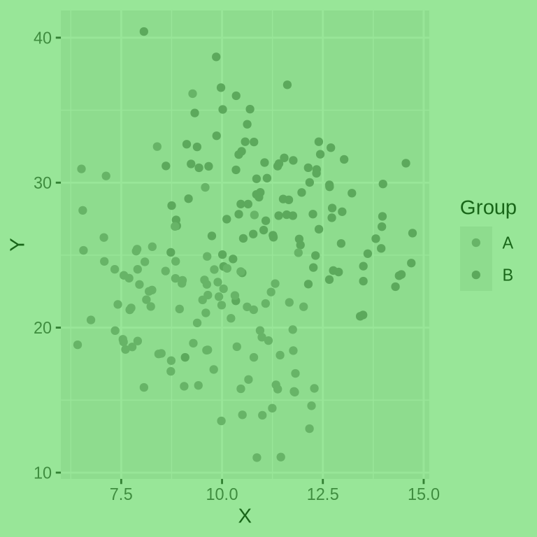
Below is an illustration of the Simpson’s Paradox at play. Notice how the overall dataset does not have a clear direction but when you color by group, both groups exhibit the same negative trend.
simpsons_df = pd.read_csv("data/simpsons_paradox_data_l.csv")
alt.Chart(simpsons_df).mark_circle().encode(
  x=alt.X('X'),
  y=alt.Y('Y'),
)
alt.Chart(simpsons_df).mark_circle().encode(
color='Group',
x=alt.X('X'),
y=alt.Y('Y'),
)In this case, grouping makes the insidious Simpson’s Paradox visually unmistakable. This is a prime example of the dual purpose of data visualization. It doesn’t just present our data to others; it deepens our understanding of it.
2.2 Strategies for grouping
The grammar of graphics gives us a convenient syntax for grouping. We simply define the encoding channel that should represent a categorical variable, using aes() in ggplot and .encode() in Altair. Color, shape, size and position are the most effective channels for grouping, and they can be easily interchanged:
.encode(color = 'category_column').encode(shape = 'category_column').encode(size = 'category_column').encode(x = 'category_column').encode(y = 'category_column')aes(color = category_column)aes(shape = category_column)aes(size = category_column)aes(x = category_column)aes(y = category_column)The main challenge in applying grouping is understanding which encoding channel to use to facilitate the comparisons we want to make. Each grouping strategy has unique strengths and pitfalls, which we shall discuss in detail.
Color
Strengths:
The human brain can detect and process color differences quickly and subconsciously. Color is a pre-attentive feature which means that the brain distinguishes between colors even without conscious attention. This effect is even more pronounced when there is a high contrast between the colors, as is the case with complimentary colors like blue and orange.
This is good news for grouping. By encoding our categorical variable as color, we can leverage the brain’s ability to infer the groups in our data. For scatterplots, this works particularly well when you have a small number of clusters. Color can be easy added without altering the layout or structure of the data visualization. This makes it a powerful way to compare the exact values of data points between groups.
- Hue is the most important for categorical colormaps, very effective
alt.Chart(simpsons_df).mark_circle().encode(
  color='Group',
  x=alt.X('X'),
  y=alt.Y('Y'),
)# Load necessary libraries
library(ggplot2)
simpsons_df <- read.csv("data/simpsons_paradox_data_l.csv")
ggplot(simpsons_df, aes(x = X, y = Y, color = Group)) +
geom_point()
Pitfalls:
- It is critical that each color be clearly distinct from the others, as too-similar colors can confuse the viewer and make categorization difficult
- Colorblindness affects approximately 8% of men and 0.5% of women globally, with the most common variant being deuteranopia, which impairs the ability to distinguish between red and green hues
- While Altair’s default color palette is designed to be color-blind friendly, ggplot’s is not.
- It is wise to limit the number of distinct categories represented by color: adding too many different colors overwhelms the visualization and makes them harder to distinguish
Shape
Shape can be used strategically in combination with color to provide an additional visual cue. This is particularly effective in contexts where colors may be difficult to distinguish.
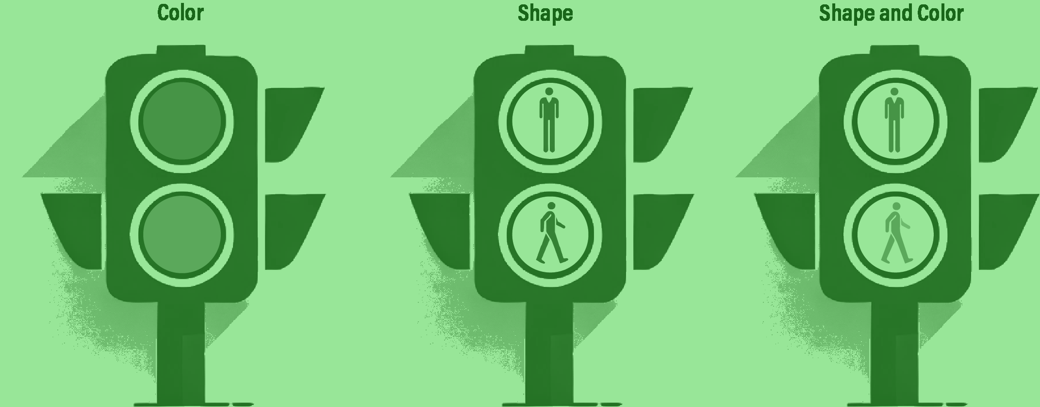
A classic example of the power of this combination is the humble traffic light. At first glance, traffic lights seem poorly designed: they use the worst possible colors for people the most common form of colorblindess: red and green. However, in many cities, traffic lights are encoded with using both color and shape. The combination of these encoding channels, alongside the use of predictable y-axis positions for both ‘Stop’ and ‘Go’ signals creates a powerful effect that has undoubtedly prevented many accidents.

We can encode shapes aesthetics the same way as color, this can make it easier to distinguish the groups.
alt.Chart(simpsons_df).mark_circle().encode(
  shape='Group',
  color='Group',
  x=alt.X('X'),
  y=alt.Y('Y'),
)
# Load necessary libraries
library(ggplot2)
simpsons_df <- read.csv("data/simpsons_paradox_data_l.csv")
ggplot(simpsons_df, aes(x = X, y = Y, shape = Group, color=Group)) +
geom_point()
The combination of shape and color can make grouping clearer than either of these categories alone. However, there are some important caveats. At line-drawings or outlines can make color difficult to distinguish as it reduces the area that is colored. It is preferable to use filled shapes when combining these encoding channels.
Another important consideration is the size of the shapes. It is much easier for the viewer to distinguish between larger shapes than smaller ones. If you have a scatterplot with tiny marks, you may want to restrict the number of unique shapes you show, or consider avoiding shape altogether.
Size
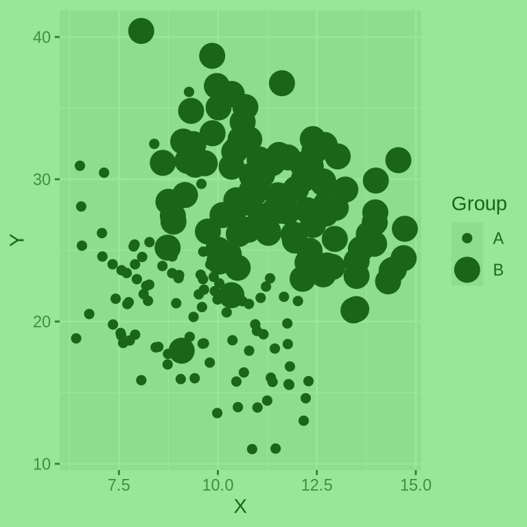
Size is more useful for ordinal categories. Hello.
We are not great at judging areas.
alt.Chart(simpsons_df).mark_circle().encode(
  size='Group',
  x=alt.X('X'),
  y=alt.Y('Y'),
)
# Load necessary libraries
library(ggplot2)
simpsons_df <- read.csv("data/simpsons_paradox_data_l.csv")
ggplot(simpsons_df, aes(x = X, y = Y, size = Group)) +
geom_point()Warning: Using size for a discrete variable is not advised.
Position
2.3 Introduction to faceting
Include summary sheet with strengths and weaknesses of each grouping strategy. 2